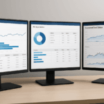
For marketing teams in Singapore and the Philippines, proving value to the C-suite is no longer about showing activity volumes or reporting on vanity metrics. Chief executives, finance leaders, and commercial directors want a clear line of sight from marketing investment to pipeline, revenue, retention, and enterprise growth. That expectation is especially strong in markets where digital adoption is high, buying journeys are fragmented across channels, and leadership teams expect disciplined resource allocation. Data visualisation gives marketing leaders a practical way to translate complex performance data into business evidence the C-suite can use, trust, and act on.
Strong visual reporting does more than make dashboards look polished. It turns multi-source marketing data into decision-ready intelligence by exposing trends, exceptions, correlations, and forecast scenarios that are hard to detect in tables alone. When done correctly, it helps marketers move the conversation from “What did we do?” to “What business outcome did it produce, why did it happen, and what should we do next?” That shift matters for organisations operating across Singapore and the Philippines, where regional leadership often needs to reconcile local channel performance, market maturity, and commercial priorities in one coherent view.
Why C-suite stakeholders need a different kind of marketing reporting
The C-suite does not evaluate marketing through the same lens as channel managers. Executives care about business contribution, risk, efficiency, and predictability. They want to understand how marketing influences qualified pipeline, customer acquisition cost, lifetime value, payback period, and retention, not just clicks or impressions. A report that shows strong social engagement but no downstream impact on opportunity creation rarely changes budget decisions.
In board-level settings, the most valuable reporting framework is one that aligns marketing outcomes with enterprise goals. That usually means connecting campaign data to CRM records, revenue data, and finance-approved definitions of contribution. For example, a Singapore-based B2B software firm may run regional demand generation campaigns across search, LinkedIn, webinars, and partner channels. The C-suite will not be satisfied with channel-level leads alone. They will want to see which campaigns produced sales-accepted opportunities, which segments closed faster, and which sources delivered the highest margin or lifetime value.
Translate marketing language into business language
Data visualisation helps convert marketing terminology into finance and commercial language. Instead of presenting “MQL volume,” show the percentage of MQLs that progressed to SQL, opportunity, and closed-won revenue. Instead of highlighting “engagement rate,” show how content interaction correlates with conversion velocity or deal size. Instead of reporting on “cost per click,” show cost per qualified opportunity by channel.
This translation is essential because executive stakeholders often review marketing performance alongside sales, operations, and finance data. If the reporting vocabulary does not match how the business measures success, the conversation stalls. Visualisation creates a bridge by showing the relationship between marketing inputs and enterprise outputs in a format the board can absorb in minutes.
Build a marketing measurement model before you design the dashboard
Many dashboard projects fail because teams start with charts instead of measurement logic. Before deciding what to visualise, define the commercial questions the dashboard must answer. For C-suite reporting, those questions usually include: Which channels drive the most efficient pipeline? Which segments convert best? Which campaigns influence revenue? Which markets are over or underperforming against target? What is the payback period for marketing investment?
A measurement model should establish the hierarchy of metrics, from leading indicators to lagging outcomes. Leading indicators may include website engagement, search visibility, account engagement, webinar attendance, or form completion rates. Lagging indicators include qualified opportunities, revenue, renewal rate, and customer expansion. The visualisation should show how early signals connect to later outcomes, not just display each metric in isolation.
Define metric ownership and source of truth
Executive trust depends on data governance. If marketing, sales, and finance each maintain different versions of the same metric, the dashboard becomes a debate tool rather than a decision tool. Establish a source of truth for each key metric, typically by aligning CRM data, marketing automation data, web analytics, and finance systems. Document attribution rules, lead stage definitions, and time windows for reporting.
For example, if a Singapore or Philippines business uses HubSpot, Salesforce, and Google Analytics 4, the reporting layer should define how contacts are matched to accounts, how opportunities are counted, and whether revenue is attributed on first touch, last touch, or multi-touch logic. The C-suite does not need the full technical schema on every slide, but they do need assurance that the numbers are consistent and governed.
Choose the right visual forms for executive decision-making
Not every chart type supports strategic decisions. The best executive dashboards use a small set of visual forms that make comparisons, trends, and anomalies obvious. Cluttered dashboards filled with pie charts, overly dense tables, and decorative widgets usually reduce comprehension. The objective is not to display every available data point. The objective is to highlight the few signals that explain performance and inform action.
For C-suite reporting, the most effective charts usually include scorecards, trend lines, funnel visuals, stacked bars, heat maps, cohort charts, and scatter plots. Each serves a different analytical purpose. Scorecards show whether marketing is ahead or behind target. Trend lines show momentum over time. Funnel visuals show conversion leakage. Heat maps reveal channel or segment concentration. Cohort charts expose retention or repeat engagement. Scatter plots can show relationships between spend efficiency and conversion outcomes.
Use scorecards for business KPIs
Scorecards work well when the executive team needs a quick status check. They should present target, actual, variance, and period change for the most important business metrics. A strong scorecard does not simply state “pipeline generated.” It should show pipeline generated versus target, pipeline by geography, and month-over-month or quarter-over-quarter movement. For organisations in Singapore and the Philippines, this is especially useful when leadership wants visibility into local market performance within a regional portfolio.
Use funnel visuals to show leakage and conversion quality
Funnel charts are effective when the central question is where prospects drop off. A C-suite audience will often ask why lead volume is high but revenue is weak. A funnel can show where conversion rates decline across stages, such as visit to lead, lead to MQL, MQL to SQL, SQL to opportunity, and opportunity to closed-won. If the funnel is segmented by market, campaign, or industry vertical, it can reveal whether the issue is lead quality, sales follow-up, offer relevance, or market fit.
Use cohort and trend analysis for strategic pattern recognition
Cohort views are powerful when leadership needs to understand how performance evolves over time. For example, a quarterly cohort chart can show whether leads from a specific campaign source convert faster or slower than those from another source. A trend line can reveal whether organic search contributes a growing share of qualified pipeline over six months, or whether paid media efficiency is declining as cost inflation rises. These are exactly the kinds of patterns executives need when allocating budget across channels.
Connect visualisation to attribution, forecasting, and scenario planning
To prove marketing value at the top level, visualisation needs to do more than describe the past. It should support attribution, forecast likely outcomes, and help leaders compare scenarios. This is where many organisations underuse their data stack. They may have the raw data needed to answer strategic questions, but they visualise only historical totals, leaving the board without a view of future impact.
Attribution visualisation should reflect commercial reality
Attribution is not a purely technical exercise. It is a governance decision that shapes budget allocation. Multi-touch attribution can help show how channels contribute across the buyer journey, particularly in long B2B cycles. However, it should be implemented with realistic expectations and clear assumptions. If executives see one channel consistently “owning” revenue because of a last-click model, they may overinvest in lower-funnel tactics and underfund demand creation. If they see a multi-touch model without explanation, they may distrust the output entirely.
Visualise attribution in a way that distinguishes influence from source. For instance, a stacked bar chart can show the mix of first touch, assisted touch, and closed-won contribution by channel. A Sankey diagram can illustrate how prospects move from awareness channels to conversion channels, though it should be used sparingly to avoid visual complexity. The goal is not to impress leadership with advanced design. It is to clarify which investments support revenue creation.
Forecasts help the C-suite see what happens if spend changes
Forecast visualisation increases the strategic value of marketing reporting. If you can show that a given spend level is likely to produce a certain pipeline range, the conversation becomes far more commercial. Forecasts should include assumptions, such as conversion rates, average deal size, sales cycle length, and channel efficiency. Displaying a forecast range, rather than a single point estimate, is more honest and more useful for decision-making.
In a Singapore or Philippines context, where economic conditions, hiring capacity, and market maturity can shift quickly, scenario planning is especially relevant. A simple visual can compare base case, upside case, and downside case outcomes for pipeline or revenue based on changes in campaign investment. Executives do not need a mathematical lecture. They need visibility into how different budget choices influence business results.
Use dashboard design principles that improve trust and comprehension
Even the best metric framework can fail if the presentation creates confusion. Executive dashboards should be designed for clarity, consistency, and speed. Use one screen or one page per business question. Avoid excessive colours, mixed chart scales, or unrelated metrics that force the viewer to search for meaning. Every visual should have a purpose, a label, and a clear takeaway.
Hierarchy matters. Put the most important business KPIs at the top, followed by supporting breakdowns and then diagnostic detail. Use consistent time frames across visuals, such as month-to-date, quarter-to-date, or rolling twelve months. If the dashboard includes markets across Singapore and the Philippines, ensure currency, timezone, and reporting period definitions are standardised. A dashboard loses credibility fast when the same metric appears to change depending on how it is sliced.
Reduce cognitive load with disciplined annotation
Annotations are one of the most underused elements in executive reporting. A short note explaining a spike, drop, or anomaly can save hours of interpretation. For example, if pipeline dropped in a given month because a major event was moved to the next quarter, say so directly on the chart. If paid search cost rose because of competitive bidding, annotate the trend. These notes are not decoration. They demonstrate analytical maturity and reduce the chance of misreading the data.
Use threshold lines, benchmark markers, and variance indicators to make deviations obvious. A line chart with a target reference line is often more effective than a complex dashboard full of isolated numbers. The C-suite wants to know whether performance is on track, what changed, and which lever to pull next.
Practical examples of how B2B teams can visualise marketing value
A B2B technology provider selling into Singapore and the Philippines can use a multi-layer dashboard to show how search, paid social, webinars, and partner referrals contribute to pipeline by segment. The top layer displays total marketing sourced pipeline versus target. The second layer breaks out performance by channel and geography. The third layer shows conversion rates, average deal size, and sales cycle velocity. This structure helps leadership understand not only how much pipeline marketing produced, but where it came from and how efficiently it converted.
A professional services firm can use cohort charts to show that leads from thought leadership content close at a higher rate than leads from generic lead generation offers. If the visual also shows shorter sales cycles and higher average contract values for those cohorts, it gives the C-suite a strong case for investing in authority-building content. That is the kind of evidence senior leadership respects because it ties content strategy to commercial outcomes.
An e-commerce or retail brand with operations in both Singapore and the Philippines can compare return on ad spend, customer acquisition cost, and repeat purchase rate across audiences. If the visual shows that one segment has a lower first-order ROAS but a much higher repeat rate, leadership can make a more informed decision about acquisition strategy. Without visualisation, that trade-off is easy to miss.
Implementation checklist for executive-ready marketing visualisation
Use the checklist below to move from raw data to a C-suite reporting system that supports budget, performance, and strategic decisions.
- Define the business questions the dashboard must answer before selecting chart types.
- Agree on metric definitions across marketing, sales, and finance to avoid reporting disputes.
- Connect CRM, marketing automation, web analytics, and finance data into a governed reporting layer.
- Prioritise a small set of KPIs tied to pipeline, revenue, retention, efficiency, and forecast confidence.
- Use scorecards for status, trend lines for momentum, funnels for conversion leakage, and cohort views for pattern analysis.
- Show attribution in a way that distinguishes influence, source, and closed-won contribution.
- Include assumptions and ranges in forecast visuals so leaders understand uncertainty.
- Annotate anomalies and major campaign events directly on the dashboard.
- Standardise date ranges, currency, and regional views across Singapore and the Philippines.
- Review dashboards with finance and sales stakeholders before publishing them to the executive team.
Teams that treat visualisation as a strategic communications layer, not a decorative reporting layer, are far more likely to win executive trust. The strongest dashboards do not overwhelm leaders with detail. They show where marketing is creating value, where performance is leaking, and which decisions will improve business outcomes next.

I am Tricia Huang Mei, an Advertising Partner in Sotavento Medios with over two decades of experience in the Singapore advertising and business sectors. My career is defined by a commitment to driving high-impact marketing campaigns and fostering sustainable growth for the diverse business portfolios I manage.